Farmland In New York State
Micaela Lipman
Introduction
Land in farms within the United States has decreased drastically over time, with a consolidation of unique species found in farmland mosaics (White 1998; Freemark et al. 2002). Decrease in land in farms has negative implications for biodiversity of local wildlife habitats and stormwater filtering, food sovereignty, loss of cultural heritage and rural employment patterns (White 1998; Narducci et al. 2019). Loss of farmland remains a key economic concern for rural areas where land use and employment patterns have not evolved past a focus on the family farm (Edgens and Staley 1999). The federal government of the United States has recognized the negative impacts of loss of farmland, resulting in the passage of the 1996 Farm and Ranch Land Protection Program and 2002 Farm Bill (Bergstrom and Ready 2003; Sokolow 2010). However, federal policies are often structured in ways which disproportionately subsidize certain commodities such as soybeans and cotton, which are not grown at high rates in New York State (Haaren and Bills 2007). The following analyses aims to display how farms and farmland have decreased over time in New York State. Based on the literature, I expect land in farms to decrease over time with the steepest decline occurring after World War II and the decline becoming more shallow after the 1990s with the introduction of farmer support programs. As land in farms decreases, I expect to see some consolidation of small family farms into larger more industrial farms. Measuring erosion of farmland and consolidation of farms is crucial to informing scholarly work in neighboring themes of environmental degradation, loss of food sovereignty, and rural unemployment.
Materials and methods
In order to conduct the proposed analyses, I have extracted land in farms (acres), and number of farms (#) the years 1910, 1920, 1925, 1930, 1940, 1945, 1950, 1954, 1959, 1964, 1969, 1974, 1978, 1982, 1987, 1992, 1997, 2002, 2007, 2012, and 2017 from the US Agriculture Census administered by the USDA for all counties in New York State. These are the only years for which county level data is made available. I have also extracted the population of each county in NYS for the years 1920, 1930, 1940, 1950, 1960, 1970, 1980, 1990, 2000, 2010, 2012, and 2017 from US Decennial Census Data and ACS 1 year estimate Census Data.
By dividing the number of farms by the land in acres in each county, I calculated the average size of farms in each county by year. By dividing the land in acres in each county by the population within each county, I calculated the acres per person in each county by year. Unfortunately, population estimates are not available at the county level for years 1910, 1925, 1935, 1945, 1954, 1959, 1964 or 1969. Therefore, acres per person was not able to be calculated in these years and as population does not grow linearly, I did not want to apply a mid point method. Such table data was merged in R with county polygon data provided through the TIGER package using county name as the unique identifier.
Data:
The data I extracted is made available at: [https://github.com/GEO511-2021/2021_project-MicaelaFLipman/blob/ea0119a7c180fabed5d48131db971a109c57de23/LongForm.csv]
Results
library(tidyverse)
library(dplyr)
library(ggplot2)
library(readr)
library(RCurl)
library(tidyverse)
library(maps)
library(ggthemes)
library(scales)
library(gganimate)
library(readxl)
library(tigris)
options(tigris_use_cache=TRUE)
library(transformr)

#IMPORT DATA FROM GITHUB
LongForm <-read.csv("data/LongFormGEOID.csv")

NYCounties <- tigris::counties(year = 2015, state = "NY", class = "sf", resolution = "500k") %>%
  mutate(GEOID=as.numeric(GEOID))


##Merging Data
AllCounties2<-left_join(x=NYCounties, y=LongForm, by="GEOID", all.x=TRUE)

AllCounties<-AllCounties2 %>%
  mutate(LandInAcres=as.numeric(LandInAcres)) %>%
   mutate(Year=as.numeric(Year)) %>%
   mutate(NumberofFarms=as.numeric(NumberofFarms)) %>%
  mutate(AvSizeFarmAcres=as.numeric(AvSizeFarmAcres)) %>%
   mutate(PercTotAcresInFarm=as.numeric(PercTotAcresInFarm)) %>%
   mutate(Population=as.numeric(Population)) %>%
 mutate(LandInAcresPerPopulation=as.numeric(LandInAcresPerPopulation))
After running several preliminary scatterplots to show land in farms across time in New York State, including an animated scatterplot, I animated a map to visually display the trend of decreasing farmland across all counties over time. Interestingly, after the steepest decline in the 1960s and 1970s, corresponding with a strengthening of the Farm Bill and legislation to support farmers, acres of farms seems to stabilize. ### Static Plot: Acres in Farmland: 1910-2017
ggplot(
  data=AllCounties,
  aes(
    x=Year,
    y = LandInAcres)) +
  geom_smooth() +
  theme_minimal() +
  labs(
    x='Year',
    y='Acres') +
  ggtitle("Farm Acres In New York State")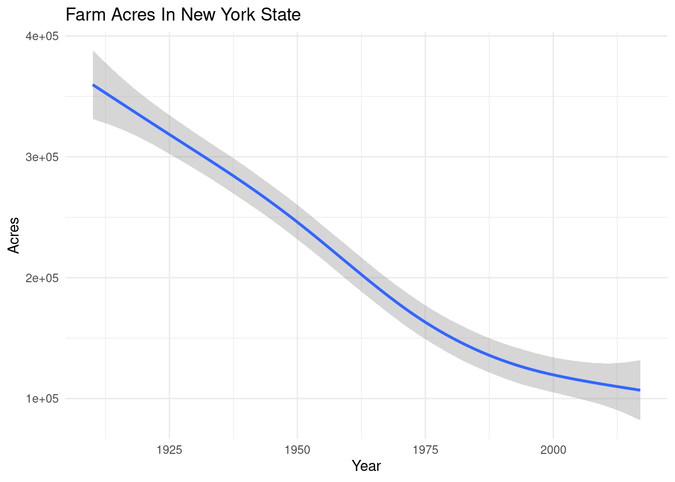
anim1<-ggplot(
    AllCounties,
    aes(
        LandInAcres,
        NumberofFarms)) +
  geom_point(
    alpha = 0.7,
    show.legend = FALSE) +
  scale_size(range = c(2, 12)) +
  theme_minimal() +
  transition_time(Year) +
  ease_aes('linear')+
  scale_x_continuous(labels = scales::comma) +
  labs(
    title = "Erosion of Farms in New York State",
    x = 'Farmland (Acres)',
    y = 'Number Of Farms',
    subtitle = 'Year:{round(frame_time)}')

anim1
## NULLAnimated Map: Acres in Farmland: 1910-2017
anim2<-ggplot() +
  geom_sf(
    data = AllCounties,
    mapping = aes(
                fill = LandInAcres/100000,
                geometry = geometry),
                color = NA) +
  scale_fill_distiller(
    palette = "YlGn",
    direction = 1,
    limits=c(0,9),
    n.breaks = 4,
    label=comma,
    name = "Acres in farmland (100,000 acres)",
    guide = "colorbar") +
  theme_map() +
  theme(legend.position = "bottom")  +
  transition_time(Year) +
  ease_aes('linear') +
    labs(
    title = "Acres in Farmland: 1910-2017",
    x = NULL,
    y = NULL,
    subtitle = 'Year: {round(frame_time)}')


anim2
## NULLThese same results are presented in a second visual format of a faceted map which also displays change in acres in farmland over time.
Faceted Map: Acres in Farmland: 1910-2017
facet2<-ggplot() +
  geom_sf(
    data = AllCounties,
    mapping = aes(
      fill = LandInAcres/100000,
      geometry = geometry),
    color = NA) +
  scale_fill_distiller(
    palette = "YlGn",
    direction = 1,
    limits=c(0,9),
    n.breaks = 4,
    label=comma,
    name = "Acres in farmland (100,000 acres)",
    guide = "colorbar") +
  labs(
    title = "Acres in Farmland: 1910-2017",
    x = NULL,
    y = NULL) +
  theme_map() +
  theme(legend.position = "bottom") +
  facet_wrap(facets = ~ Year)
facet2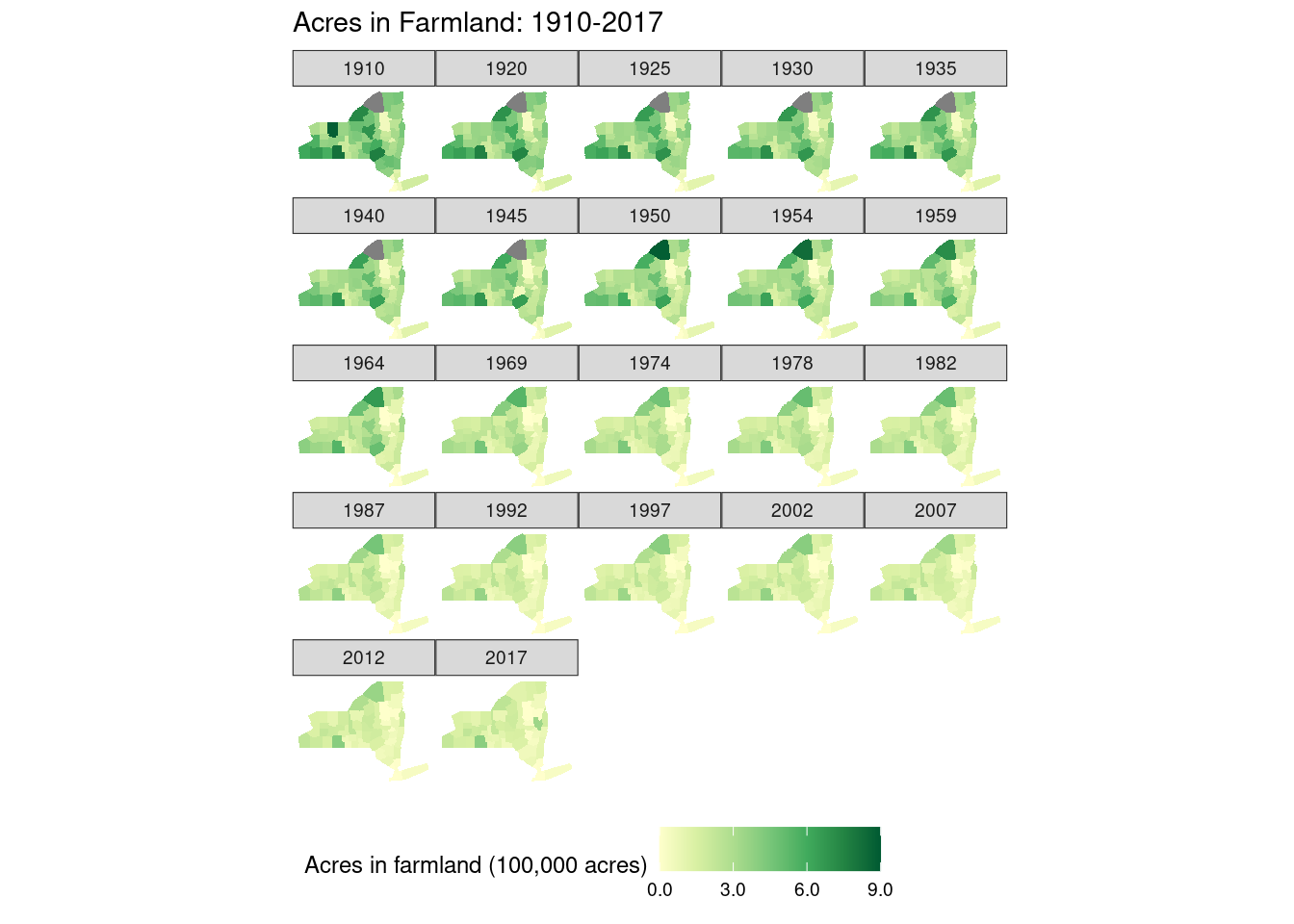
However, there is a spatial bias to analyzing simply the raw acreage of land in farms in each county as some counties are larger than others. Therefore, the second set of data points presented in the animated and then faceted maps below analyze the land in farms in a county as a proportion of total acreage of farms. Over time, the proportion of land in farms decreased from 74% across New York State in 1910 to 1.63% across New York State in 2017. This change in land use patterning is quite drastic.
Animated Map: Proportion of County Acreage in Farmland: 1910-2017
ggplot() +
  geom_sf(
    data = AllCounties,
    mapping = aes(
                fill = PercTotAcresInFarm,
                geometry = geometry),
                color = NA) +
  scale_fill_distiller(
    palette = "YlGn",
    direction = 1,
    limits=c(0,1),
    n.breaks = 6,
    name = "Proportion of acres in farmland",
    guide = "colorbar") +
  theme_map() +
  theme(
    legend.position = "bottom") +
   transition_time(Year) +
  ease_aes('linear') +
  labs(
    title = "Proportion of County Acreage in Farmland: 1910-2017",
    x = NULL,
    y = NULL,
    subtitle = 'Year:{round(frame_time)}')
## NULLFaceted Map: Proportion of County Acreage in Farmland: 1910-2017
facet1<-ggplot() +
  geom_sf(
    data = AllCounties,
    mapping = aes(
      fill = PercTotAcresInFarm,
      geometry = geometry),
    color = NA) +
  scale_fill_distiller(
    palette = "YlGn",
    direction = 1,
    limits=c(0,1),
    n.breaks = 6,
    name = "Proportion of acres in farmland",
    guide = "colorbar") +
  labs(
    title = "Proportion of County Acreage in Farmland: 1910-2017",
    x = NULL,
    y = NULL) +
  theme_map() +
  theme(
    legend.position = "bottom") +
  facet_wrap(facets=.~Year)

facet1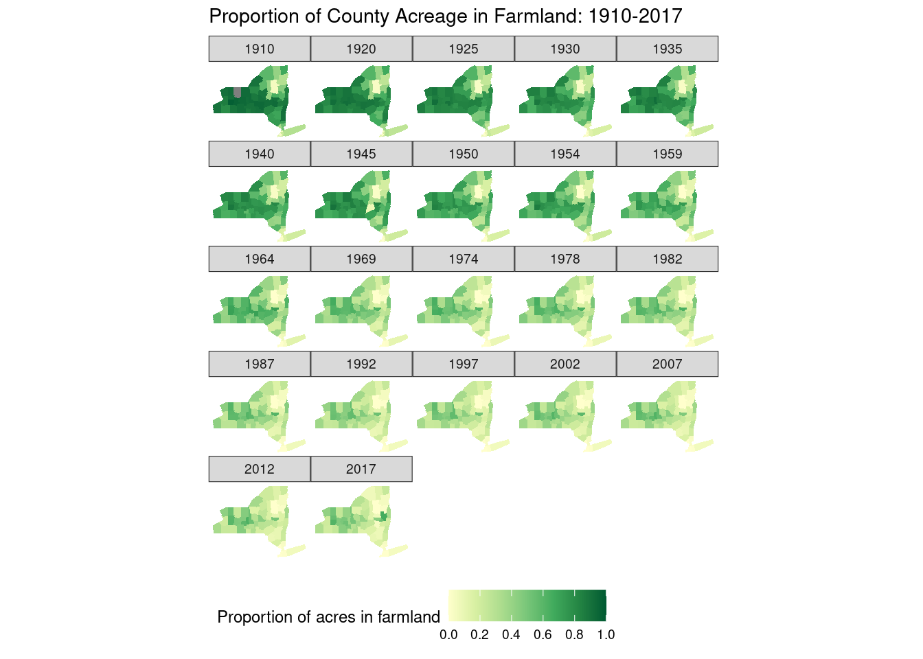
The following scatterplot addresses the fact that population in New York State has increased over time. This scatterplot is not presented by county in order to avoid the bias of local food systems (Born and Purcell 2006). The myth that higher population densities must be supported by higher proportions of local land in farms in order to provide adequate food resources and environmental resources to support a denser population has been largely debunked, most notably by Born and Purcell (2006). Rather a regional approach should be used to address resource constraints. Therefore, the plot below shows a smoothed generalized linear model representing farms per person across counties in New York State over time. This plot shows that on average, acres in farms per person has decreased from over 6 acres in 1920 to under 2 acres in 2017. Possibly this stark erosion of farmland is due to the increased demands more dense populations place on competing land uses such as housing which would crowd out the land available to farms. This hypothesis is supported by the following data visualizations and overall by central place theory in urban and regional planning (Dacey, 1965). However, the data visualizations are insufficient to prove the hypothesis on their own and additional comparative research would need to be conducted.
Static Plot: Acres of Farms per Person in New York State
ggplot(
  data=AllCounties,
  aes(
    x=Year,
    y = LandInAcresPerPopulation)) +
  geom_smooth() +
  theme_minimal() +
  labs(
    x='Year',
    y = 'Acres/Person') +
  ggtitle("Acres of Farms per Person in New York State")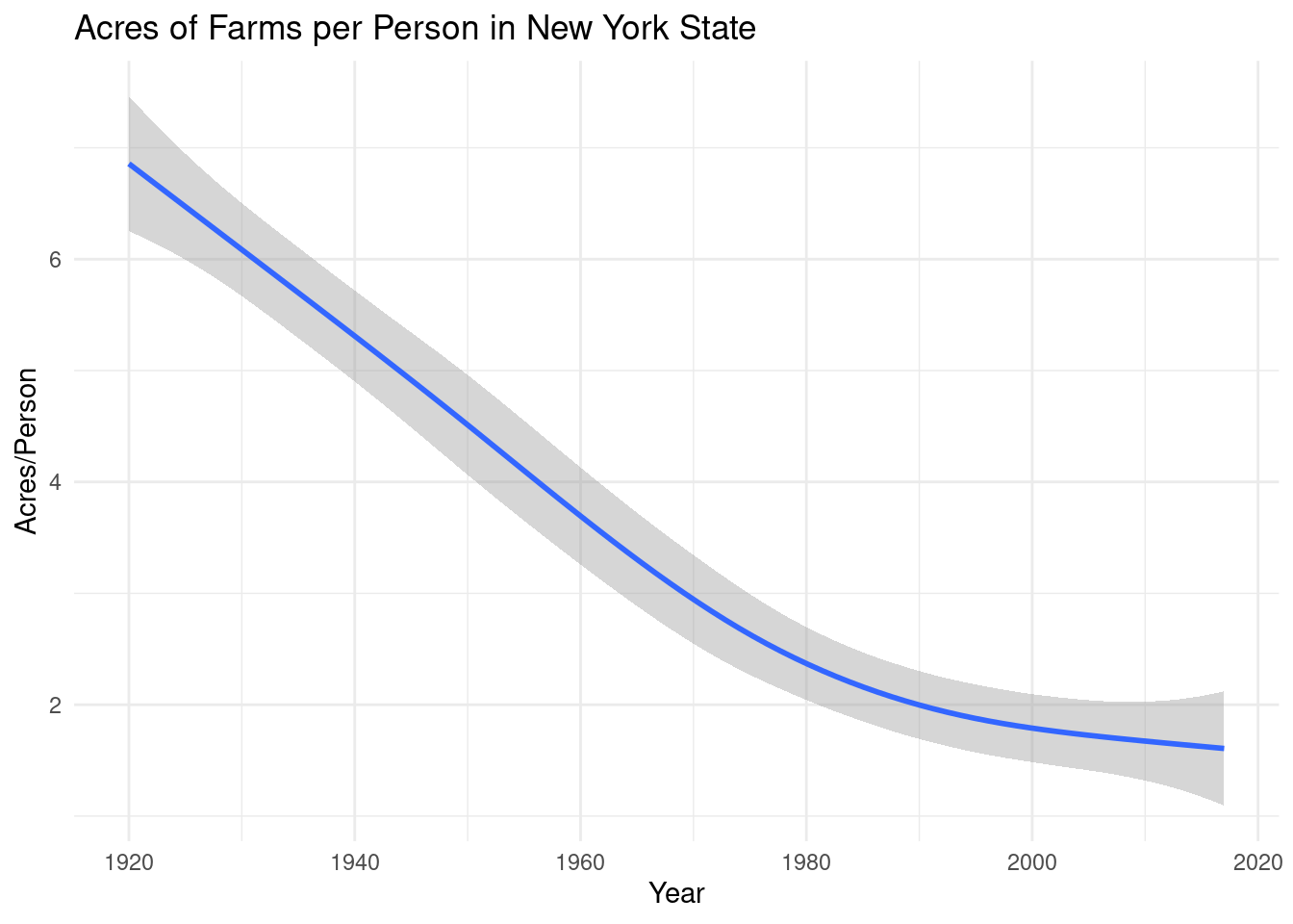
The final data visualizations displayed shows the average size of farms in New York State. Potentially due to decreasing profitability of the small family farm over time and pressures for farmers to scale up in order to ensure success and reach certain government subsidy threshholds, up until the early 1990s, the average size of farms increased representing the decline of the family farm. Interestingly, in the early 1990s, the direction of the trend line reversed with the average size of farms decreasing and then plateouing out in recent years. This reversal in trends is quite interesting and is not addressed in wider literature.
Static Plot: Average Size of Farms In New York State
ggplot(
  data=AllCounties,
  aes(
    x=Year,
    y = AvSizeFarmAcres)) +
  geom_smooth() +
  theme_minimal() +
  labs(
    x='Year',
    y='Acres') +
  ggtitle("Average Size of Farms In New York State")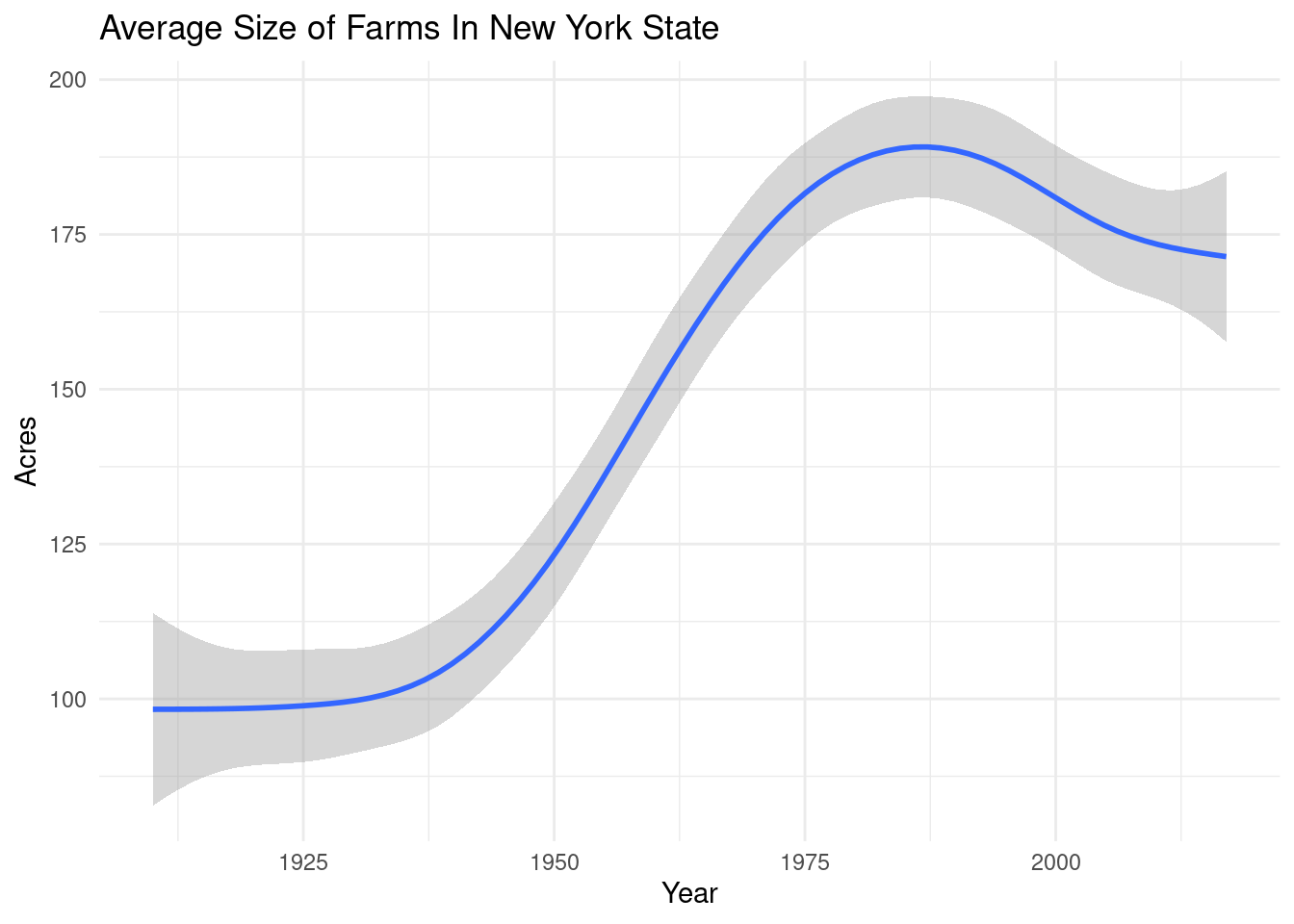
Conclusion
In conclusion, while learning to construct animated maps and scatterplots was fruitful for my own learning opportunities, it turned out that more simple plots of overall trends were more instructive in answering my two key research questions outlined in the introduction. The first hypothesis outlined in the introduction were supported by the data visualizations above. Erosion of land in farms did increase during post World War II suburbanization and did decline after the implementation of farmer support programs in the 1990s. The second hypothesis outlined in the introduction was supported in generality by the data visualizations above in that the trend across most years was towards an increasing farm size across counties. However, this trend appears to have reversed in the early 1990s with a leveling out of the size of farms in New York State counties in recent decades. This reversal in trend is quite interesting and is an area where fruitful additional research could take place.
References
Bergstrom, John C., and Richard C. Ready. “Economic Valuation of Farm and Ranch Land Amenities: What Economists Have Learned About Public Values and Preferences.” (2003).
Born, Branden, and Mark Purcell. “Avoiding the local trap: Scale and food systems in planning research.” Journal of planning education and research 26, no. 2 (2006): 195-207.
Dacey, Michael F. “The geometry of central place theory.” Geografiska Annaler: Series B, Human Geography 47, no. 2 (1965): 111-124.
Edgens, Jefferson G., and Samuel R. Staley. “The myth of farmland loss.” In Forum for applied research and public policy, vol. 14, pp. 29-34. Executive Sciences Institute Inc, 1999.
Freemark, Kathryn E., Céline Boutin, and Cathy J. Keddy. “Importance of farmland habitats for conservation of plant species.” Conservation Biology 16, no. 2 (2002): 399-412.
Haaren, Christina V., and Nelson L. Bills. “Agri-environmental programs in the US and the EU: lessons from Germany and New York State.” (2007).
Narducci, Jenna, Cristina Quintas-Soriano, Antonio Castro, Rebecca Som-Castellano, and Jodi S. Brandt. “Implications of urban growth and farmland loss for ecosystem services in the western United States.” Land Use Policy 86 (2019): 1-11.
Sokolow, Alvin D. “Federal policy for preserving farmland: The farm and ranch lands protection program.” Publius: The Journal of Federalism 40, no. 2 (2010): 235-256.
White, Jeanne S. “Beating plowshares into townhomes: The loss of farmland and strategies for slowing its conversion to nonagricultural uses.” Envtl. L. 28 (1998): 113.