Data Preparation
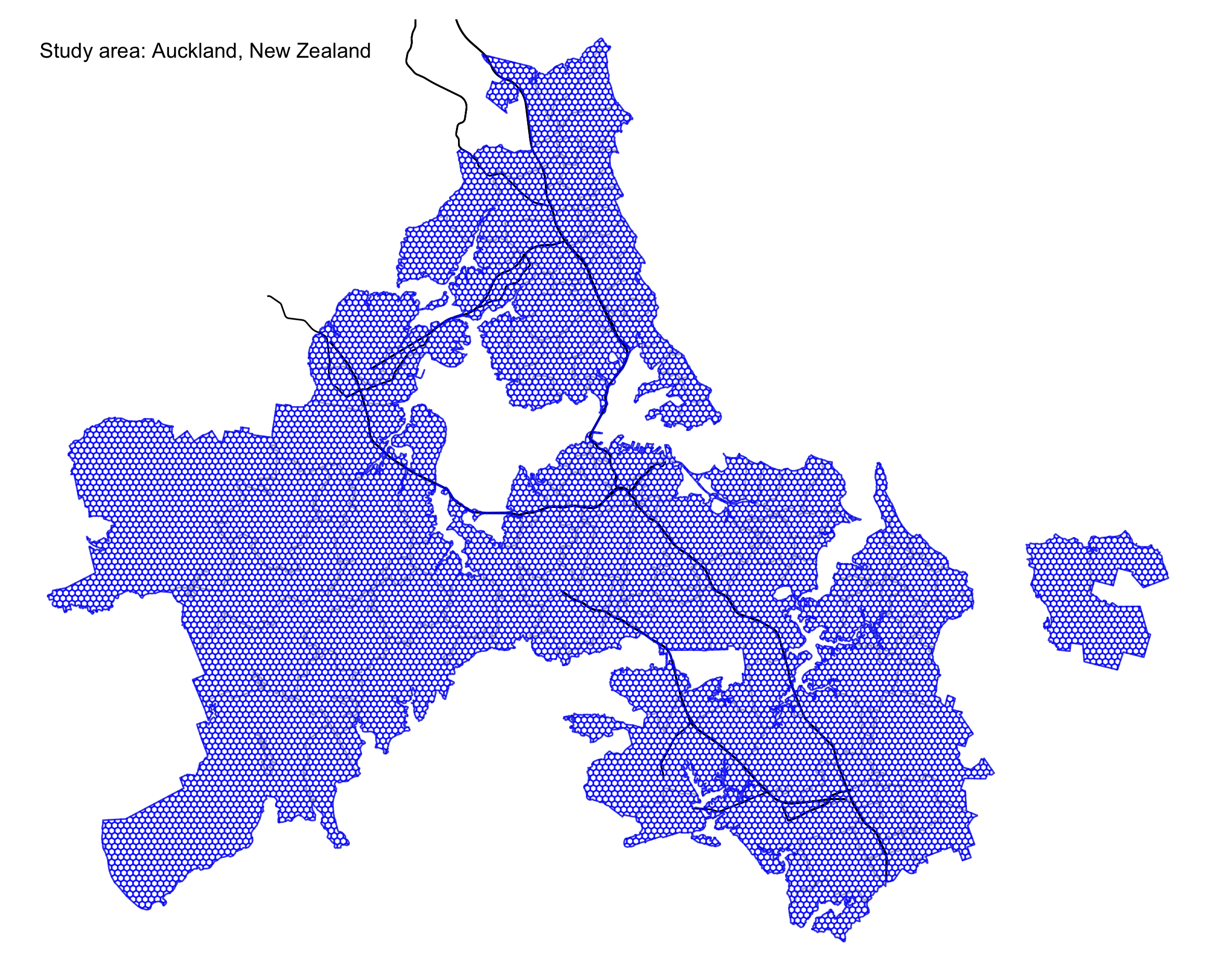
Study area: Auckland city
Figure 1 represents the study area - Auckland city in New Zealand.
# New Zealand boundary
sf_akl <- read_sf(here("data/raw/auckland-boundary/auckland_boundary.shp"))

# New Zealand highway centrelines
highway_centrlines <- read_sf(here("data/raw/nz-state-highway-centrelines-SHP/nz-state-highway-centrelines.shp")) %>%
  st_transform(crs = 2193) %>% # convert crs to New Zealand
  st_intersection(., sf_akl) # spatial join with Auckland boundary


# hexagonal grid cell
grids <- read_sf(here("data/raw/grids_shp/grids300.shp"), quiet = T) %>%
  st_transform(crs = 2193)
# create a map to overview the study area
p_auckland <- tm_shape(sf_akl) +
    tm_borders(col = "grey") +
    tm_shape(highway_centrlines) +
    tm_lines() +
    tm_shape(grids) +
    tm_borders(col = "blue", alpha = 0.7) +
    tm_layout(frame = F,
              title = "Study area: Auckland, New Zealand",
              title.position = c("left", "top"),
              title.size = 0.8)
tmap_save(p_auckland, here("img/auckland.png"))
Mobile location data of users
To help get sense of the mobile location data, I take 30 data points as examples and present them in Table 1. Each data point includes four attributes:
u_id: the unique identifier for each user;timestamp: the specific time for each data point created;grid_id: the location for each data point created;home: the inferred home location of each user.
# identified home locations
identified_hms <- readRDS(here("data/raw/hm_hmlc.rds")) %>%
  mutate(home = as.integer(home))

# mobile location data points of users
df <- readRDS(here("data/raw/mobility_sample.rds")) %>%
  sample_frac(size = 1)

# join home locations to users
df <- df %>% left_join(., identified_hms, by = c("u_id" = "u_id"))
DT::datatable(df %>% head(30),
              options = list(pageLength = 5),
              caption = "Table 1: Random examples of the mobile location data.")
# grid cells with data points
considered_grid_cells <- df$grid_id %>% unique()
Social Diversity Analysis
Separate data with biweek interval
In order to compare the potential changes of diversity over time, the first step is to separate the data into multiple periods. I use a two-week interval and separate the data into 26 periods.
# create break points of every two weeks
biweekly_seqs <- seq(as.POSIXct("2020-01-01"), as.POSIXct("2020-12-31"), by = "2 weeks") %>%
  as.Date()

# give each period a label, easier for subsequent analysis
prepare_labels <- function(index.start, index.end, weekly_seqs){
  start_day <- weekly_seqs[index.start] %>% format(., "%b %d")
  end_day <- weekly_seqs[index.end] %>% format(., "%b %d")
  paste(start_day, "-", end_day)
}
biweek_labels <- map2_chr(seq(1, 26, 1), seq(2, 27, 1), function(x, y) prepare_labels(x, y, biweekly_seqs))

# separate biweek data and store them
get_biweekly_data <- function(df, biweek_labels, index.start, index.end){
  output <- df %>%
    mutate(date = as.Date(timestamp)) %>%
    filter(date >= biweekly_seqs[index.start] & date < biweekly_seqs[index.end]) %>%
    mutate(period = biweek_labels[index.start])
  saveRDS(output, file = paste0(here("data/derived/biweekly-data/biweek_"), index.start, ".rds"))
}

## if function: if all biweekly data files exist, do not need to re-run the get_biweekly_data fun
if(length(list.files(here("data/derived/biweekly-data"), pattern = "*.rds")) != 26){
  ## parallel mapping
  map2(seq(1, 26, 1), seq(2, 27, 1), function(x, y) get_biweekly_data(df, biweek_labels, x, y))
}
Construct spatial sectors
To operationalize diversity, one important step is to construct the spatial sectors. The dynamic sectors change along with grid cell locations is created based on different radius distance and directions (Chen, Chuang, and Poorthuis 2021). An example of spatial sectors of a grid cell is shown in Figure 2, where visitors visiting from the same sectors are considered as the same “species.” The concept of “species” will be used in the subsequent diversity analysis.
# step 1: get centers of grid cells
grid_centroids <- grids %>%
  filter(grid_id %in% considered_grid_cells) %>%
  st_centroid()
# step 2: create buffers for each grid cell
## buffer radius
radius <- c(1000, 3000, 5000, 7000, 10000, 20000, 30000, 60000)
## draw buffers
draw_buffers <- function(df_centroids, radius, grid_index){
  grid_centroid <- df_centroids %>% filter(grid_id == grid_index)
  buffers <- list()
  for (i in 1:length(radius)){
    if(i == 1){
      buffers[[i]] <- grid_centroid %>%
        st_buffer(., dist = radius[1]) %>%
        mutate(radius = radius[1])
    } else{
      buffers[[i]] <- st_difference(
        grid_centroid %>% st_buffer(., dist = radius[i]),
        grid_centroid %>% st_buffer(., dist = radius[i-1])) %>%
        dplyr::select(-grid_id.1) %>%
        mutate(radius = radius[i])
    }
  }
  do.call(rbind, buffers)
}

##!!!note: this step takes more than 1 hour, the processed data is stored in `data/derived/` folder, which can be directly loaded.
## process all grid cells
if(file.exists(here("data/derived/grid_buffers.rds"))){
  grid_buffers <- readRDS(here("data/derived/grid_buffers.rds"))
}else{
  # parallel mapping
  grid_buffers <- map_df(grid_centroids$grid_id, function(x) draw_buffers(grid_centroids, radius, x))
  saveRDS(grid_buffers, file = here("data/derived/grid_buffers.rds"))
}
# step 3: cut buffers to create spatial sectors
##cut single buffer
cut_buffer <- function(buffer, buffer_id, blades, grid_index){
  lwgeom::st_split(st_geometry(buffer[buffer_id, ]), blades) %>%
    st_collection_extract("POLYGON") %>%
    st_sf() %>%
    mutate(grid_id = grid_index) %>%
    dplyr::select(grid_id)
}

get_cut_buffer <- function(df_centroids, df_buffers, shift, grid_index, crs = 2193){
  # get input grid centroid
  centroid <- df_centroids %>%
    filter(grid_id == grid_index) %>%
    st_coordinates() %>%
    as_tibble() %>%
    set_names(c("lon", "lat")) # convert geometry to lon and lat
  # create blades
  blades <- st_linestring(
    rbind(c(centroid$lon+shift, centroid$lat),
          c(centroid$lon-shift, centroid$lat),
          c(centroid$lon, centroid$lat),
          c(centroid$lon, centroid$lat+shift),
          c(centroid$lon, centroid$lat-shift))) %>%
    st_sfc(., crs = crs)
  # get buffer for input grid
  buffer <- df_buffers %>% filter(grid_id == grid_index)
  buffer1 <- buffer[1, ] %>% dplyr::select(grid_id)
  buffer <- buffer[-1, ] ## do not cut the first inner buffer
  buffer_ids <- 1:nrow(buffer)
  ## embed function within another function
  rbind(buffer1, do.call(rbind, map(buffer_ids, function(x) cut_buffer(buffer, x, blades, grid_index)))) %>%
    rowid_to_column(var = "sector_id")
}

# process all grid cells
if(file.exists(here::here("data/derived/grid_sectors.rds"))){
  grid_sectors <- readRDS(here::here("data/derived/grid_sectors.rds"))
}else{
  # parallel mapping
  grid_sectors <-  map_df(grid_centroids$grid_id, function(x) get_cut_buffer(grid_centroids, grid_buffers, shift = 60000, x))
  saveRDS(grid_sectors, file = here::here("data/derived/grid_sectors.rds"))
}
grid_sectors_example <- grid_sectors %>%
  filter(grid_id == 15955) %>%
  mutate(sector_id = factor(sector_id))

sectors_showcase <- grid_sectors_example %>%
  st_intersection(grids, .) %>%
  group_by(sector_id) %>%
  summarise()

p_sector_showcase <- tm_shape(grids) +
  tm_polygons(col = "white", alpha = 0.1, border.col = "grey") +
  tm_shape(sectors_showcase) +
  tm_polygons(col = "sector_id", border.col = "purple", alpha = 0.9) +
  tm_shape(grids %>% filter(grid_id == 15955)) +
  tm_polygons(col = "red") +  ## target grid
  tm_shape(grid_sectors_example) +
  tm_borders(col = "purple", lty = 2) +
  tm_text(text = "sector_id", size = 0.6, col = "black") +
  tm_layout(legend.show = FALSE)
tmap_save(p_sector_showcase, here("img/p_sector_showcase.png"))
Analyze diversity
After constructing spatial sectors for each grid cell, I apply the concept of biological diversity from ecology (Tramer 1969; Maignan et al. 2003) and use Shannon’s index (\(H\)) to measure the diversity. The Shannon’s index is calculated as:
\[H = -\sum_{i = 1}^{S}p_ilnp_i\]
where \(p_i\) is the proportion of users that allied to “species” \(i\) (i.e., sectors in this study) and \(S\) is the frequency of “species.”
## compute users in each visited grid
get_visitors_in_visited_grid <- function(users_in_grids, grid_index, grids, identified_hms){
  users <- users_in_grids %>% filter(grid_id == grid_index)
  users %>%
    left_join(., identified_hms) %>%
    na.omit() %>%
    rename(visited_grid = grid_id) %>%
    filter(home != grid_index) %>%  ##remove locals
    left_join(., grids, by = c("home" = "grid_id")) %>%
    rename(home_geometry = geometry) %>%
    st_as_sf(crs = 2193)
}

cal_diversity <- function(visitors_in_visited_grids, grid_sectors, sf_akl, grids, list_grids, index){
  ##visitors in the visited grid
  visitors_in_visited_grid <- visitors_in_visited_grids[[index]]

  if(nrow(visitors_in_visited_grid) == 0){
    output <- tibble()
  }else{
    ## visited grid id
    visited_grid <- unique(visitors_in_visited_grid$visited_grid)

    if(visited_grid %in% list_grids){
      ## remove locals
      visitors_in_visited_grid <- visitors_in_visited_grid %>%
        filter(home != visited_grid)

      ## sectors of the visited grid
      visited_grid_cutted_buffers <- grid_sectors %>% filter(grid_id == visited_grid)
      ## sectors within auckland
      ack_buffer_regions <- st_join(visited_grid_cutted_buffers, sf_akl) %>%
        na.omit() %>%
        dplyr::select(-id, -city_name) %>%
        unique()

      ## get visitors in each regions and remove the duplicates
      df_joined <- st_join(ack_buffer_regions, visitors_in_visited_grid) %>% na.omit()
      df_joined_drop_duplicates <- df_joined[!duplicated(df_joined$u_id), ]

      output <- df_joined_drop_duplicates %>%
        group_by(sector_id) %>%
        dplyr::summarise(n_user = n_distinct(u_id)) %>%
        ungroup() %>%
        mutate(area_km_square = as.numeric(st_area(.)/1000000)) %>%
        mutate(user_density_per_km = n_user/area_km_square) %>%
        st_set_geometry(NULL) %>%
        distinct(sector_id, user_density_per_km) %>%
        spread(sector_id, user_density_per_km) %>%
        diversity(index = "shannon") %>%
        tibble::enframe(name = NULL) %>%
        mutate(visited_grid = visited_grid) %>%
        dplyr::select(visited_grid, value) %>%
        dplyr::rename(div = value)
    }else{
      output <- tibble()
    }
  }
  return(output)
}

# calculate diversity
cal_diversity_biweek <- function(file.nm, label.date_range){
  # get file path
  file_to_read <- paste0(here("data/derived/biweekly-data/"), file.nm, ".rds")

  # read biweekly data
  df <- readRDS(file_to_read)

  # grids with data records
  grid_ids <- df$grid_id %>% unique()

  # distinct users in each grid
  users_in_grids <- df %>% distinct(u_id, grid_id)

  # filter visitors in each grid cell, i.e., users whose home locations are not the same as the visited grid cells
  message("Start aggregating visitors...")
  visitors_in_visited_grids <- map(grid_ids, function(x) get_visitors_in_visited_grid(users_in_grids, x, grids, identified_hms))
  message("Finish aggregating visitors!")

  # filter grid with at least 2 visitors
  list_grids <- do.call(bind_rows, visitors_in_visited_grids) %>%
    st_set_geometry(NULL) %>%
    group_by(visited_grid) %>%
    summarise(n = n_distinct(u_id)) %>%
    filter(n >= 2) %>% # filter grid with at least 2 visitors
    pull(visited_grid)

  # measure diversity
  message("Start calculating diveristy...")
  diversity_shannon <- do.call(rbind, map(1:length(visitors_in_visited_grids), function(x) cal_diversity(visitors_in_visited_grids, grid_sectors, sf_akl, grids, list_grids, x)))
  # modify the diversity (normalize)
  diversity_shannon <-  diversity_shannon %>%
      left_join(., grids, by = c("visited_grid" = "grid_id")) %>%
      st_as_sf() %>%
      st_transform(crs = 2193) %>%
      mutate(norm_div = (div - min(div))/(max(div) - min(div)),
             norm_div = round(norm_div, 2),
             date_range = label.date_range) %>%
      dplyr::select(visited_grid, div, norm_div, date_range)
  message("Finish calculating diversity!")

  # save the result
  saveRDS(diversity_shannon, file = paste0(here("data/derived/biweekly-diversity/"), "div_", file.nm, ".rds"))
}

files <- paste0("biweek_", seq(1, 26, 1))
##!!note: this process takes around 5 hrs, the computed results are stored under `data/derived/biweekly-diversity` folder
map2(files, biweek_labels, purrrogress::with_progress(function(x, y) cal_diversity_biweek(file.nm = x, label.date_range = y)))
# load computed diversity
file_pathes <- paste0(here::here("data/derived/biweekly-diversity/"), "div_biweek_", seq(1, 26, 1), ".rds")
df_divs <- map(file_pathes, function(x) readRDS(x))
df_divs[[1]] %>% head()
## Simple feature collection with 6 features and 4 fields
## Geometry type: MULTIPOLYGON
## Dimension:     XY
## Bounding box:  xmin: 1755917 ymin: 5905575 xmax: 1769417 ymax: 5935279
## Projected CRS: NZGD2000 / New Zealand Transverse Mercator 2000
## # A tibble: 6 × 5
##   visited_grid    div norm_div date_range                               geometry
##          <int>  <dbl>    <dbl> <chr>                          <MULTIPOLYGON [m]>
## 1        17820 0.0701     0.06 Jan 01 - Jan 15 (((1759517 5905575, 1759367 5905…
## 2        15898 0.0111     0.01 Jan 01 - Jan 15 (((1756067 5934933, 1756043 5934…
## 3        16387 0.308      0.25 Jan 01 - Jan 15 (((1756967 5920903, 1756828 5920…
## 4        23410 0.500      0.41 Jan 01 - Jan 15 (((1769267 5905835, 1769117 5905…
## 5        16979 0.637      0.53 Jan 01 - Jan 15 (((1758017 5915447, 1757867 5915…
## 6        16645 0.961      0.79 Jan 01 - Jan 15 (((1757417 5920644, 1757267 5920…
Results
Static visualization
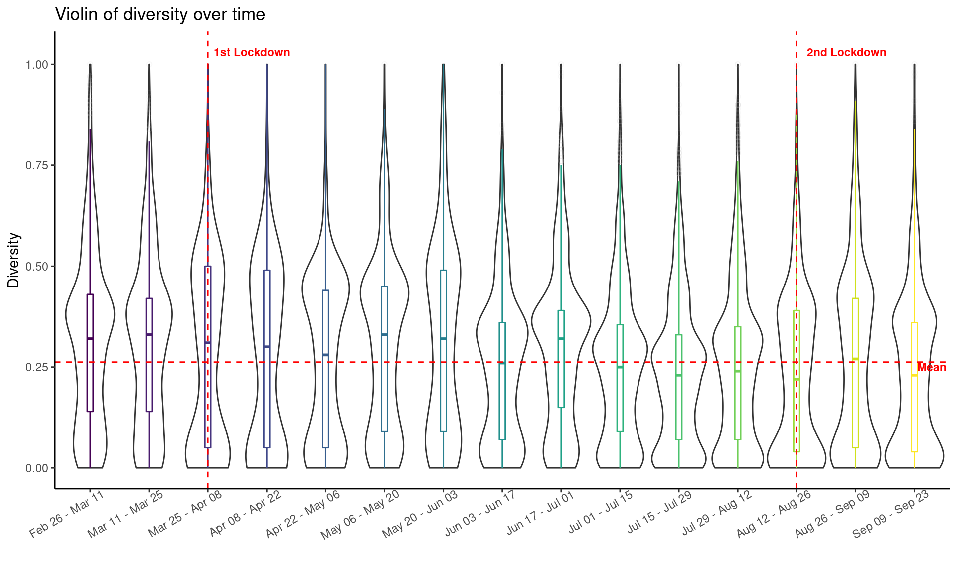
The violin plot shown below represents the kernel probability density of the diversity at different biweekly periods starting from Feb 26, 2020 (one month before the 1st lockdown) to Sep 23, 2020 (i.e., one month after the 2nd lockdown). The horizontal red dash line refers to the average diversity of all geographical places over the whole period and the two vertical red dash lines refer to the two lockdown mundanes (one at March 25, 2020 and the other on Aug 12, 2020). On the date of the 1st lockdown, New Zealand moved to Alert Level 4 (highest alert level) and the entire nation went into self-isolation. On the date of the 2nd lockdown, Auckland resion moved to Alert Level 3. We can observe that the diversity drops immediate after the two lockdowns, indicating the timely effect of the stringent measures put in place.
df_divs_combined <- do.call(rbind, df_divs)
# order the date range
date_range_levels <- unique(df_divs_combined$date_range)
# only consider periods one month before the lock down until one month after the second lock down
df_divs_combined <- df_divs_combined %>%
  mutate(date_range = factor(date_range, levels = date_range_levels)) %>%
  filter(date_range %in% date_range_levels[5:19])
mean_div <- mean(df_divs_combined$norm_div)
df_labels <- tibble(
  x = c(3.75, 13.85, 15.3),
  y = c(1.03, 1.03, 0.25),
  label = c("1st Lockdown", "2nd Lockdown", "Mean")
)
df_divs_combined %>%
  st_set_geometry(NULL) %>%
  ggplot(., aes(x = date_range, y = norm_div)) +
  geom_violin(width=1, color = "grey20") +
  geom_boxplot(aes(color = date_range),
               width=0.1, alpha=0.2,
               outlier.colour = "grey",
               outlier.shape = 1,
               outlier.alpha = 0.1) +
  geom_vline(xintercept = 3, color = "red", lty = 2) +
  geom_vline(xintercept = 13, color = "red", lty = 2) +
  geom_hline(yintercept = mean_div, color = "red", lty = 2) +
  geom_text(data = df_labels,
            aes(x = x, y = y, label = label),
            color = "red",
            size = 3,
            fontface="bold") +
  viridis::scale_color_viridis(discrete = TRUE) +
  theme_classic() +
  theme(axis.text.x = element_text(angle = 30, hjust = 0.85),
        legend.position = "NULL") +
  labs(x = "", y = "Diversity",
       title = "Violin of diversity over time")
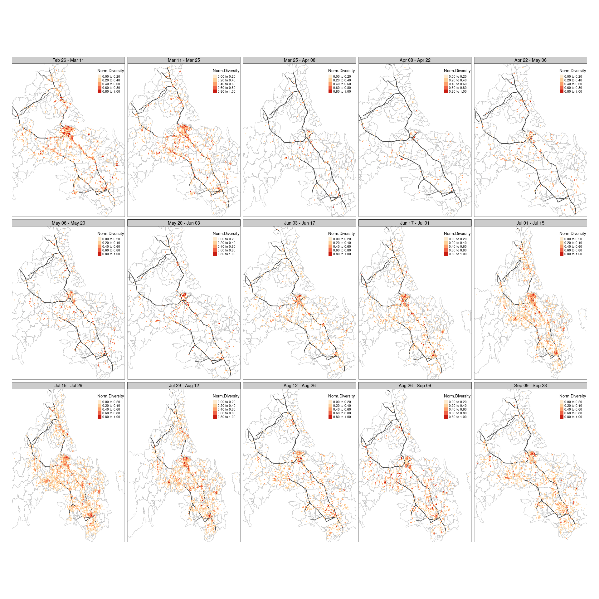
To compare the changes over space, I visualized the spatial distribution of each biweekly period as shown below. It is obviously to see that the spatial patterns are quite different. For example, during Mar 25 to Apr 08, we can see the diversity has significantly decreased compared to the that during Mar 11 to Mar 25, especial in the central CBD area. In addition, the number of geographical places that has diversity value (i.e., hexagonal grid cells) became much smaller. This is because the lockdown has marked drastic alternations on people’s daily movements, therefore, most of places showed a sharp drop of visiting frequency, or even no visitors at all. This again indicates the timely effect of lockdown mundane on human mobility.
Moreover, the diversity remained relatively low during the four biweekly periods after the 1st lockdown, and slowly increased on the 5th biweekly, as New Zealand started to move to Alert Level 1, which means the restrictions were released. We can see than the diversity slowly increase and the diversity returned to a comparable spatial pattern before the lockdown around July. Similar changes was observed for the 2nd lockdown, where the diversity delined immediately after the lockdown but not as significant as the first lockdown. The possible reasons could be that the 2nd lockdown was less strict than the 1st lockdown and people may be getting fatigue about it.
# mapping
tm_shape(sf_akl) +
      tm_borders(col = "grey") +
      tm_shape(highway_centrlines) +
      tm_lines(col = "grey20", lwd = 2, alpha = 0.7) +
      tm_shape(df_divs_combined) +
      tm_fill("norm_div",
              palette = "OrRd",
              style = "fixed",
              breaks = c(0, 0.2, 0.4, 0.6, 0.8, 1.0),
              legend.format = list(digits = 2),
              title = "Norm.Diversity") +
  tm_facets(by = "date_range", ncol = 5) +
  tm_layout(legend.position = c(0.75, 0.8),
            legend.outside = F)
Interactive visualization
The interactive dashboard allows users to investigate underlying insights of specific metrics from data or from measured results. User can choose metrics that they are interested in and visualize results in different way. This is especially useful in this project as the interactive dashboard provides the flexibility to zoom in specific place in the city and examine the metrics (e.g., social diversity, standard deviation of diversity, travel distance of visitors) in that place. From this point of view, I created a interactive dashboard to help understand the outcomes. With the dashboard, you can easily to zoom in and zoom out, choose different bi-weekly period or specific location (grid cell ID). Different metrics are presented in different pages, but they are synchronous. In other words, the results of different metrics changes simultaneously with the selected date range or grid cell. The video below shows a simple demo of the dashboard. As the dashboard is built upon Shinny apps and it is running locally, so I don’t provide codes here.
Conclusions
In this project, I focused on comparing the changes in human mobility patterns under the COVID-19 impact, especially during the stringent lockdown periods. In order to compare the potential changes, I took a mobility indicator named diversity as a proxy of human footprints and conducted the analysis leveraging mobile location data. The results show the diversity significantly declined after the two lockdown mundane, indicating the strict measures put in place have timely effects on human footprints. This is expected as people were required to remain at home and only went out for essentials during the lockdown periods, therefore, results in significantly different diversity patterns in space and time.
In addition, the results also show the diversity decreased less after the 2nd lockdown compared to that after the 1st lockdown. Moreover, the diversity showed a slow increase after the restrictions released. It would be interesting to compare the recovery rate of different lockdown. Another direction could be looking into places that have the largest diversity changes and combine other factors, such as socio-economics and demographic characteristics, to understand the underlying insights.
3 Social Diversity Analysis
3.1 Separate data with biweek interval
In order to compare the potential changes of diversity over time, the first step is to separate the data into multiple periods. I use a two-week interval and separate the data into 26 periods.
3.2 Construct spatial sectors
To operationalize diversity, one important step is to construct the spatial sectors. The dynamic sectors change along with grid cell locations is created based on different radius distance and directions (Chen, Chuang, and Poorthuis 2021). An example of spatial sectors of a grid cell is shown in Figure 2, where visitors visiting from the same sectors are considered as the same “species.” The concept of “species” will be used in the subsequent diversity analysis.
Figure 2. An example of spatial sectors of a grid cell.
3.3 Analyze diversity
After constructing spatial sectors for each grid cell, I apply the concept of biological diversity from ecology (Tramer 1969; Maignan et al. 2003) and use Shannon’s index (\(H\)) to measure the diversity. The Shannon’s index is calculated as:
\[H = -\sum_{i = 1}^{S}p_ilnp_i\]
where \(p_i\) is the proportion of users that allied to “species” \(i\) (i.e., sectors in this study) and \(S\) is the frequency of “species.”